

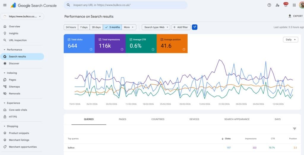

Of all the reports inside Google Search Console, the Performance report is the one I spend the most time in, and the one I think most SEOs only scratch the surface of. It is the closest to getting accurate data (even though a lot of data is missing from search console at least it is real): real queries, real impressions, real clicks, logged by Google itself. We get no sampling estimates, no third-party approximations, no crawled-rankings guesswork.
It’s funny though because a HUGE amount of the SEO community use third party data over 1st party data (3rd party tools like SEMRUSH, AHREFS etc).

What follows is a complete walkthrough of the report as I actually use it, what each metric really measures, how the date and comparison controls behave, the quirks of the filters, where regex unlocks things the UI otherwise can’t do, the export ceilings you’ll hit sooner than you think, and the anonymisation rules that are behind nearly every “why don’t these numbers add up?” question I’ve ever been asked.
I’ve been using Google search console ever since it first rolled out (it was previously called Google webmaster tools) and oh how it has changed over the years!
What the Performance report is showing you

When you open the Performance report, you are looking at actual search data on your verified URL/domain property. Every number on the chart, every row in the table underneath it, represents data that Google recorded from SERP to website. A query was searched, one of your URLs was served, it either got shown or got clicked (impression indicates shown, click is self explanatory).
Inside the Performance menu you’ll usually see three separate reports:

- Search results the default, covering organic results across Web, Image, Video and News. This is the one I’m focused on in this guide.
- Discover only appears if Google has sent you Discover traffic.
- Google News only appears if you’re eligible for and have received traffic from the Google News app or news.google.com.
The vast majority of day-to-day SEO analysis happens inside the Search results report, so that’s where I’m going to focus.
The four metrics that are key in search console
Four numbers sit at the heart of the whole report. Everything else is a filter, a breakdown or a comparison of these.
Clicks count the times a user tapped through from a Google search result onto your site. Paid ad clicks are not included this is organic only.
Google dedupes certain patterns (repeated clicks inside a short window, for example), and it’s worth knowing that clicks come in two flavours: anonymised and non-anonymised. Some clicks carry query-level data, others don’t, which is going to matter when we get to the anonymisation discussion further down.
Impressions count the times one of your URLs was shown to a user on a results page, but only when the result was actually rendered on screen. If your page is sitting at position 10 on page one and 100 people run that query, you don’t pick up 100 impressions by default.
You pick up an impression for each user who scrolled far enough for your result to come into view. Impressions below the fold are only counted once the user actually scrolls down to them.
CTR is a derived number: clicks ÷ impressions, as a percentage. Because it’s calculated rather than measured directly, it inherits whatever quirks the clicks and impressions figures carry.
And context matters enormously when you read it, a 3% CTR at position 2 is weak (although AI overviews play a key part in this now), while a 3% CTR at position 9 is very good. CTR is proportionate to position. Sadly, since Google rolled out AI OVERVIEWS in search, tens of millions of sites globally have seen click decline (because AI overviews are served above traditional organic results, reducing clicks at higher positions).
Average position is the weighted mean of the top position your site held across every impression in the date range. If you showed at positions 3, 5 and 7 across three impressions, the reported position is 5. This sounds simple, but the weighting has some consequences I’ll unpack in the Queries section.
The date picker and why 16 month timeframe is the limit
The performance report defaults to the last three months. The date picker (central) gives you preset windows of 7 days, 28 days, 3 months, 6 months, 12 months and 16 months, plus a free-text custom range.

16 months is the limit. Inside the GSC interface you cannot go further back than that, as much as us SEOs wish you could, you cant.
And that’s exactly the reason that we built SEO Stack, becuse we got fed up of search console limitations.
Why 16 months?
Google’s framing is that it’s a sensible look-back window for most site owners and big enough to support proper year-on-year comparisons with a bit of overlap for sanity checks – i.e. you could compare the last 6 months year over year, but with a buffer for extra comparison time if you were to extend it to cover say, seasonality etc.
In practice, it’s a trade-off between storage economics and analytical usefulness. If you want to keep data beyond 16 months you’ve got two realistic options which are:
1. Download exports on a regular basis and archive them yourself, which, let’s face it isn’t realistic or practical unless you have a tool or own solution to extract/import exported GSC data – even then the 1000 row limit will make this non-faesible for most
2. Switch on the Bulk Data Export integration so Search Console streams into BigQuery every day, once that’s live, retention is effectively unlimited, BUT, you don’t get a user interface, so you can’t export to bigquery and access the data via search console, you would need to plug bigquery into your own UI / platform or use Looker Studio (now Data Studio again) – if you are wondering what is google bigquery? we wrote a complete guide on it
3. Use SEO Stack – we built SEO stack, it effectively acts as a data warehouse (like BigQuery) but you can continue to access all your warehoused data within the same UI, something which search console + BigQuery doesn’t provide for you
A point that some people miss is that data is usually available up to roughly one to two days ago, occasionally a bit less. If the last day or two on your chart looks lower, that’s almost always processing lag rather than a real drop. Google actually tells you when the data was last updated, look on the right-hand side of the report, near the export button, for a “last updated” timestamp.

Comparing periods with the date picker
Open the date picker and you’ll see a Compare tab. This is how you do side-by-side analysis: last 7/28/90 days against the previous equivalent stretch, year-on-year comparisons using the same calendar window, or two custom ranges of your choosing.

With comparison switched on, the chart overlays both periods solid line for the current range, dashed for the comparison and every table row gains delta columns showing the absolute and percentage change per metric. For quickly spotting which queries, pages or countries have gained or lost since the last period, there’s nothing faster in the entire tool.

Popular time-frame comparison windows are:
- Last 28 days vs previous 28 days gives you the cleanest read on short-term movement, because the weekday and weekend pattern lines up perfectly between the two windows.
- Last 28 days vs the same 28 days last year gives you genuine year-on-year movement, but you accept a minor weekday misalignment as the trade-off.
- Last 3 Months year over year – this is probably the most commonly used because you are comparing like for like in terms of time-span and time of year, this is better for understanding overall trajectory
For client reporting and strategic decisions I lean on the year-on-year comparison. For detecting live issues I lean on the period-over-period one. For example, if Google rolls out a google core update, ill compare 28 days before and 28 days after and I’ll look at query positions, compare impressions/clicks/ctr etc.
Search types

Towards the top of the report there’s a filter labelled Search type, which defaults to Web. Click it and you can switch to:
- Web standard blue-link organic results across google.com and its country variants.
- Image results surfaced inside Google Images.
- Video results where a video thumbnail was the surface element.
- News results inside the News tab of Google Search (not to be confused with the separate Google News report).
Each search type maintains its own independent set of clicks, impressions, CTR and position. One of your pages can be picking up impressions across all four surfaces simultaneously, but the figures never get rolled into a single cross-type total in the default view, when you load the report, you’re only seeing Web, and everything else is hidden until you explicitly switch or compare.
Comparing search types side by side
Clicking the Search type filter and flipping to the Compare tab puts two search types head-to-head on the same chart and table, with delta columns like date comparison.

The comparison I use quite a bit is Web vs Image. Those two filters are quite different, Image search/clicks characteristically produces fair impression counts but oft3en with low CTRs, and a lot of sites have no real sense of how much Image visibility they actually have because they never bother to look.
If you’ve invested in good original imagery, this comparison is where you’ll find out whether Google is serving any of yours.
The filter chips above the chart
Above the chart sits a row of filter chips. Each one scopes the entire report, chart, table, totals : to a subset of your data.

- Query filter by the search query.
- Page filter to a specific URL or URL pattern.
- Country filter by the country the user was searching from.
- Device Desktop, Mobile or Tablet.
- Search appearance filter to impressions that triggered specific SERP features (AMP, Web Stories, Videos, Product snippets, Review snippets, Sitelinks, Translated results and others that your site is eligible for).
- Day the same picker, now exposed as a chip once you’ve made a change.
You can stack chips to narrow progressively. Setting Country = United Kingdom + Device = Mobile + Query contains "seo audit" applies all three at once and reports on just that segment.
How the filter dialog works in practice
When you open a Query or Page filter chip, you get a small dialog with a text field and the following options:

- Contains — the value contains your string anywhere within it.
- Does not contain — the value does not contain your string.
- Exactly matches — the value equals your string verbatim.
- Does not exactly match — everything except that exact string.
- Custom (regex) — regular expression matching (see below).
- Doesn’t match regex — the inverse of the regex match.
Country, Device and Search appearance filters don’t use free-text input they pull from pre-filled items, because the values are fixed.
One thing worth noting, filters are sticky. Once applied, they stay applied until you remove them by clicking the × on the chip.
Where the filters are a pain in GSC
The filter system has a handful of limits that frustrate SEOs, and they’re one of the reasons serious analysis eventually has to leave the GSC UI.
- Only one filter per dimension at any timeYou can do “Query contains seo” OR “Query does not contain free” — you cannot have two Query filters running simultaneously without combining them into a regex.
- No native OR logic in the basic match modes “Contains A” plus “Contains B” as two separate filters is not a thing. The regex option is the escape hatch.
- String matching is case-insensitive for Contains and Exactly matches, while regex defaults to case-sensitive, which catches more people out than you’d think.
- Whitespace and URL format matterLeading and trailing spaces get trimmed, and URLs have to match the protocol and subdomain exactly as they appear in your data.
- You can’t filter by metrics at allClicks, impressions, CTR and position are measurements, not dimensions, so “only show me queries with more than 50 clicks” is impossible inside the UI. The workaround is to export and filter in a spreadsheet, or to move to the API.
Regex filters: how to actually use them
Regex is the most underused capability in the entire report. It runs on Google’s RE2 syntax, a deliberately reduced variant of PCRE that’s fast and avoids features like lookbehinds that can blow up performance. Once you’re comfortable with it, you can do filter combinations in seconds that would otherwise require multiple exports and a spreadsheet.
The rules that matter:
- Regex is case-sensitive by default. Prefix with (?i) if you want case-insensitive matching. So (?i)seo matches SEO, Seo, seo, sEo and everything in between.
- Without anchors, your expression matches anywhere inside the string. Use ^ to anchor to the start and $ to anchor to the end.
- Expressions are capped at 4,096 characters — more than enough for anything reasonable.
Some examples I use regularly:
A quirk worth flagging: when you apply regex in the Query filter, it’s tested against the query text. When you apply it in the Page filter, it’s tested against the full URL including protocol and hostname. So something like ^/blog/ won’t match anything — you need ^https://example\.com/blog/ with the literal dot escaped.
Exporting: the formats and the 1,000-row export limit
The export button sits in the top-right, and it exports whatever view you’re currently looking at the same filters, date range, search type and tab all apply. Change a filter, change the export.

Three formats are available:
- CSV — downloads as a ZIP with one CSV file per tab.
- Excel — a single .xlsx file with each tab on its own sheet.
- Google Sheets — opens straight in Drive.
The export limit: each table exports at 1,000 rows max. If you export the Queries tab, you’re getting the top 1,000 queries by whichever column you sorted on (clicks, by default), not the complete list. For small sites this is fine. For anything meaningful, it quickly becomes a pain.
This is another one of the reasons why we built SEO stack, in the past we used to use Google Sheets + Search Analytics for sheets to pull much larger data-sets.
Four ways around it:
- Filter before you exportApply filters that narrow the dataset by country, device, URL directory, or a regex that groups your queries — and export each slice separately. You can effectively pull far more than 1,000 total rows this way.
- Use the Search Console APIUp to 25,000 rows per request, with pagination, is a different universe from the UI.
- Bulk Data Export to BigQueryGoogle’s own long-term pipeline daily streaming, no row cap, SQL on top. For any serious data work this is where you should end up.
- A dedicated GSC warehousing tool that handles the export, storage and querying for you there are several on the market that bypass the 1,000-row ceiling and keep your data beyond the 16-month Google window.
Reading the chart correctly
The chart at the top plots whichever metrics you’ve toggled on clicks, impressions, CTR, position against time. Each metric has its own Y-axis when multiple are active, and each has a colour-coded totals card above the chart that doubles as a toggle.
A few behaviours worth understanding:
- The chart reflects the total for the range, with filters applied. If you’ve filtered by Query contains "seo" over the last three months, the chart is showing clicks and impressions for just those queries across those three months.
- Position is plotted inverted. Lower numbers are better, but Google draws the axis so that moving upward visually can feel wrong. I mentally translate it as “rank 1 lives at the top of the chart.”
- CTR on the chart is a daily calculation, not a cumulative one. Each day’s point is that day’s clicks divided by that day’s impressions — not a rolling average, not accumulated from earlier days.
- The totals in the metric cards are period totals. Clicks and impressions are summed across the range; CTR and position are weighted averages over the whole window.
The Queries tab and why the numbers need reading carefully
The first tab beneath the chart is Queries, and for most SEOs this is where analysis starts. Each row is a single query, with the same four metrics.
This is where the subtle behaviours really start to matter.
Clicks on a query row is the total times any of your URLs got clicked for that query during the period. Two clicks from the same user on different days, on the same query, both count.
Impressions on a query row is the number of times any URL of yours appeared in the results for that query. Here’s a point that catches people out: if two of your URLs both appeared for a single search, that counts as two impressions for that query. So if you have multiple pages ranking for the same term, the impression count on that query row is inflated relative to the number of search events behind it.
CTR is the row’s clicks divided by its impressions. Because multi-URL rankings inflate the impression count, CTR looks artificially low for queries where you have two or more pages appearing. If you see a surprisingly weak CTR on a query you expected to do well on, check whether you’ve got duplicate URLs ranking.
Position on the Queries tab is the weighted average top position of your best-ranking URL for that query across every impression in the range. Four nuances really matter:
- It’s an average, not a live rank. A page that sat at position 4 for most of the period and position 12 for the remainder will have a reported position somewhere in between — not 4, and not 12.
- The weighting is by impression volume, not by days. A single high-traffic day at position 3 can outweigh a week at position 8.
- Only your best-ranking URL is counted per impression. If pages at positions 3 and 8 both appeared in a single SERP, Google records 3.
- Position is only captured when the result was actually shown to the user. This is why the metric reflects what users genuinely saw, not a theoretical ranking.
Practically: treat GSC position as a trend signal, not a live rank tracker. If you need to know your rank right now, use a proper rank tracker. If you want to know whether you’re drifting up or down over 28 or 90 days, the Position metric in GSC is one of the most reliable signals available.
The Pages tab
Same structure as Queries, but each row is now one of your URLs rather than a search query. The four metrics describe how that URL performed across every query it appeared for during the period.
Position on this tab is the weighted average position of the URL across all of its ranking queries. This is why a genuinely good page can look like it’s ranking poorly — a page that holds #1 for one low-volume query but sits at #20 for a thousand other queries will have an average position closer to 20, pulled down by the long tail. The average is doing exactly what it says on the tin, but it can disguise strong performance on the queries that matter most.
Two things I always look for in the Pages tab:
- Pages getting lots of impressions but barely any clicks — that points to either a targeting problem (you’re ranking for queries with the wrong intent) or a SERP presentation problem (your title, meta or snippet isn’t pulling people in).
- Pages getting clicks you didn’t plan for — often these are accidental rankings where the content has drifted into terrain you didn’t consciously target, and they can be quick wins if you optimise them intentionally.
Countries, Devices, Days and Search Appearance
Countries breaks your four metrics down by the country the search originated in. Essential for international sites, and genuinely useful for single-country ones too — most sites find at least one country they didn’t realise was producing meaningful traffic.
Devices splits data across Desktop, Mobile and Tablet. Tablet is negligible on most properties now. Mobile is typically around 60–75% of traffic depending on vertical, but CTR and engagement behaviour differ sharply between mobile and desktop, so I always cross-reference both.
Days (this used to be labelled “Dates” in the older UI, and Google has since renamed it) is a day-by-day breakdown of the four metrics, effectively the table view of the chart. The fastest way to spot anomalies: if one particular day jumps or dips massively against its neighbours, you’re usually looking at a data glitch, an algorithm update, or something worth investigating further.
Search Appearance is the tab most people skip, and they shouldn’t. It only lists rows for SERP features your site has actually triggered, AMP, Videos, Web Stories, Product snippets, Review snippets, Sitelinks, FAQ results (where still supported by Google), Translated results and others. This is where you measure whether your structured data is actually earning you anything. If you’ve implemented Product markup and the Product snippet row shows zero impressions, your markup is either broken or ineligible, and you’ve got something to fix.
Filtering inside the table itself
Every tab has its own local sorting and filtering. Click any column header to sort ascending or descending, and use the small filter icon or the search box above the table (depending on which UI version you’re looking at) to narrow the visible rows by a string match.
Three behaviours to be aware of:
- Table-level filtering stacks on top of the main filter chips. If you’ve already filtered by a specific page in the chips above, then search the table for a query, you’re narrowing further within that page.
- Table search isn’t regex. If you need regex, use the Query or Page filter chip above the chart, not the table search box.
- Sorting only operates on the rows the table has loaded. If you sort by position ascending, you’re seeing the best positions among the top 1,000 rows by clicks (the default sort order), not the best positions in your whole dataset. This is one of the subtler ways the 1,000-row ceiling distorts what you’re looking at.
Anonymised data & why the chart and table never quite agree
If you’ve ever added up every row of the Queries tab and found the total doesn’t match the total on the chart, this is why — and it’s the single biggest point of confusion in the whole report.
Google anonymises rare queries. If a query has been issued by only a small number of users during the period — particularly queries that could identify an individual, contain personal information, or sit below Google’s privacy threshold — the row doesn’t appear in the Queries table at all. Google doesn’t roll it into an “other” bucket. It simply isn’t listed.
But — and this is the part people miss — the clicks and impressions from those anonymised queries are still counted in the chart totals and in the Pages, Countries, Devices and Days tabs. They’re only hidden on the Queries tab.
Which is why:
- Sum the clicks in the Queries tab and you’ll almost always get a number lower than the chart total for the same period.
- Same for impressions.
- The gap is your anonymised query volume.
- That gap varies enormously by site. Properties with lots of long-tail or locally specific queries can see gaps of 30%+. Sites dominated by commercial head terms see much smaller gaps.
Anonymised queries also affect position. Because the position on each Queries row is a weighted average across impressions for that query, and anonymised queries don’t appear on the Queries tab at all, the “average position” you’d calculate by averaging your Queries rows will not match the aggregate position on the chart.
Three more smaller sources of discrepancy worth knowing about:
- Recent data is provisional. Anything in the last 48 hours or so can still update retroactively as processing completes.
- Canonical vs reported URL. The Pages tab defaults to canonical URL reporting, but you can flip it to “URL reported” to see the URL that was actually shown. Totals between the two views can differ.
- Deduplication. Rapid repeat clicks and impressions get deduplicated under rules Google doesn’t publish in detail.
The rule I use: trust the chart totals as the real total; treat the Queries table as the visible subset that cleared Google’s privacy threshold. When you’re reporting numbers to clients, always cite the chart. When you’re doing query-level optimisation, accept that you’re seeing the head and torso of your query distribution, not the full long tail.
To wrap up
Once the mental model clicks — that the chart total is the source of truth, the Queries table is a filtered subset, position is a weighted average rather than a live rank, regex does what the default filters can’t, and the 1,000-row ceiling will push anything serious toward the API or BigQuery, you’ll read the Performance report much faster, you’ll spot problems earlier, and you’ll stop drawing conclusions from numbers that were lying to you.
Every other section in Search Console — Indexing, Core Web Vitals, Enhancements, Links, Manual Actions, is diagnostic in nature. The Performance report is the one place where you get to see whether any of that work is actually converting into visibility.